Steam is a popular gaming storefront and platform on Window, macOS, and Linux. Every month they publish their Hardware & Software Survey with overall summary statistics of their users. The data can also be segregated by operating system.
I wanted to see how the share of Linux has changed over time on Steam. Unfortunately, the survey data is only ever available for the previous month. So I wrote a small R script (GitHub link) to scrape historic survey results from the internet archive's Wayback Machine and current data directly from Valve. A few months were missing from the Wayback Machine, which was a bummer, but enough data was available to get a feel for how the metrics have changed over time.
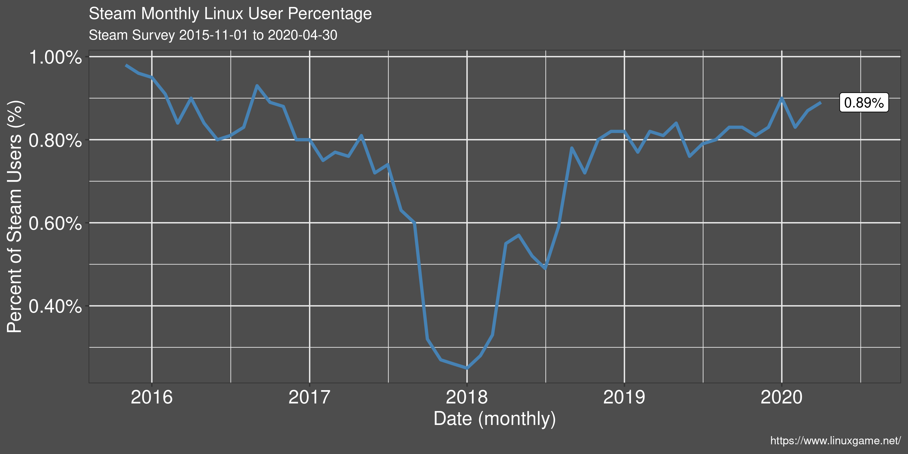
Linux User Percentage
The drop in Linux user share in late 2017 to early 2018 was due to a combination of factors. First was a counting error in the survey that Valve admitted to and later fixed. The error resulted in over-inflated user numbers from net cafes. Additionally, this time period was the peak player count for the hugely successful title PlayerUnknown's Battlegrounds. PUBG brought a lot of new players to the Steam platform from regions where net cafes are a popular way to play games. Both of these factors combined to substantially deflate the Linux user share on Steam.
Because of overall growth of Steam however, a drop in Linux share does not necessarily mean an absolute drop in Linux players. In Steam 2019 Year in Review, they mention and monthly active user count of almost 95 million. That equates to about 850k monthly Linux players during 2019.
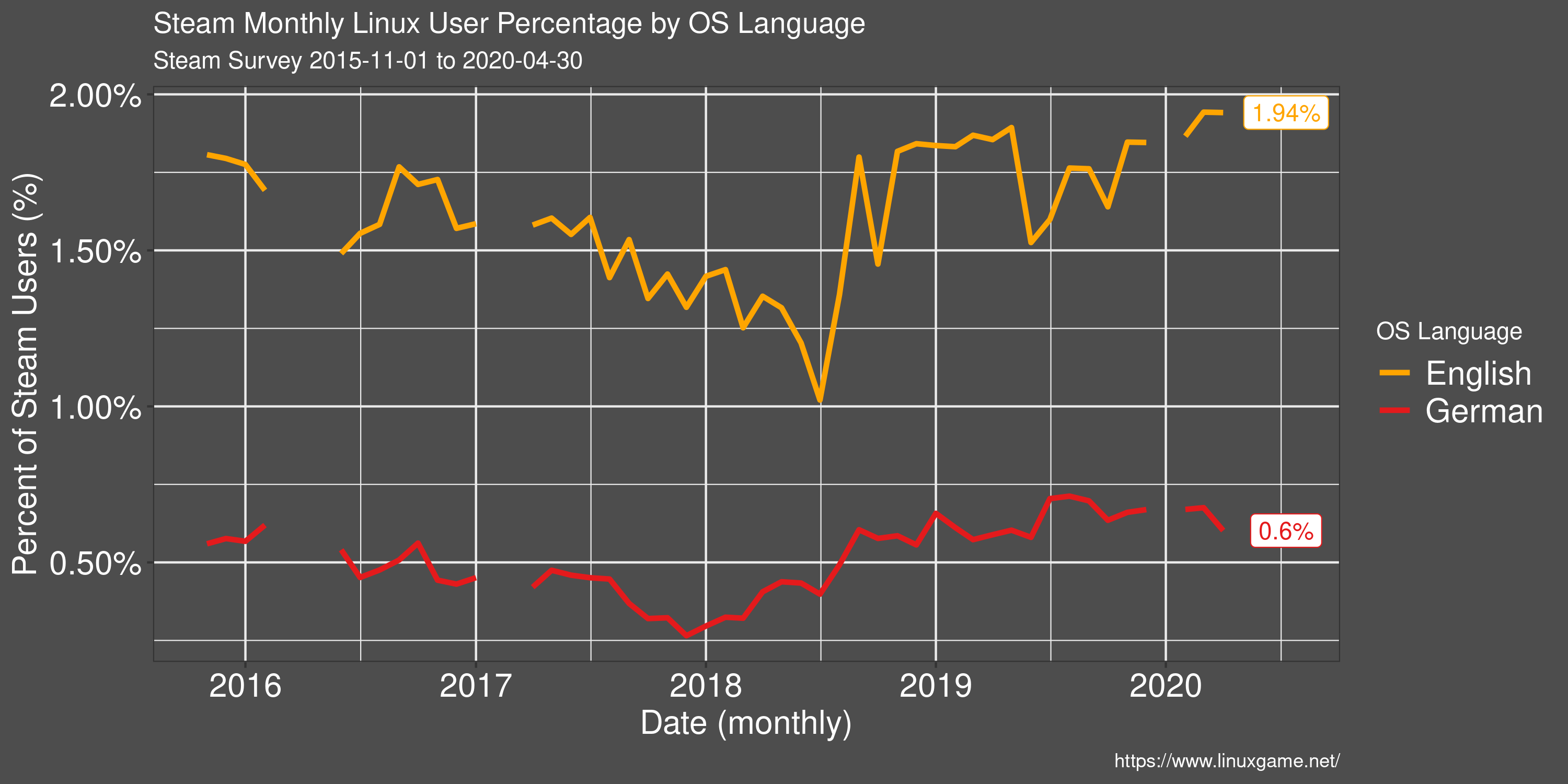
Linux User Percentage by OS Language
Restricting to reported OS language shows some interesting results with regards to the Linux share on Steam. The percentage of Linux users, of those with an English language OS, is around twice that of the general population. It's unclear whether this difference is due more English speakers preferring Linux, or more Linux users preferring English. But it's a surprising difference non-the-less.
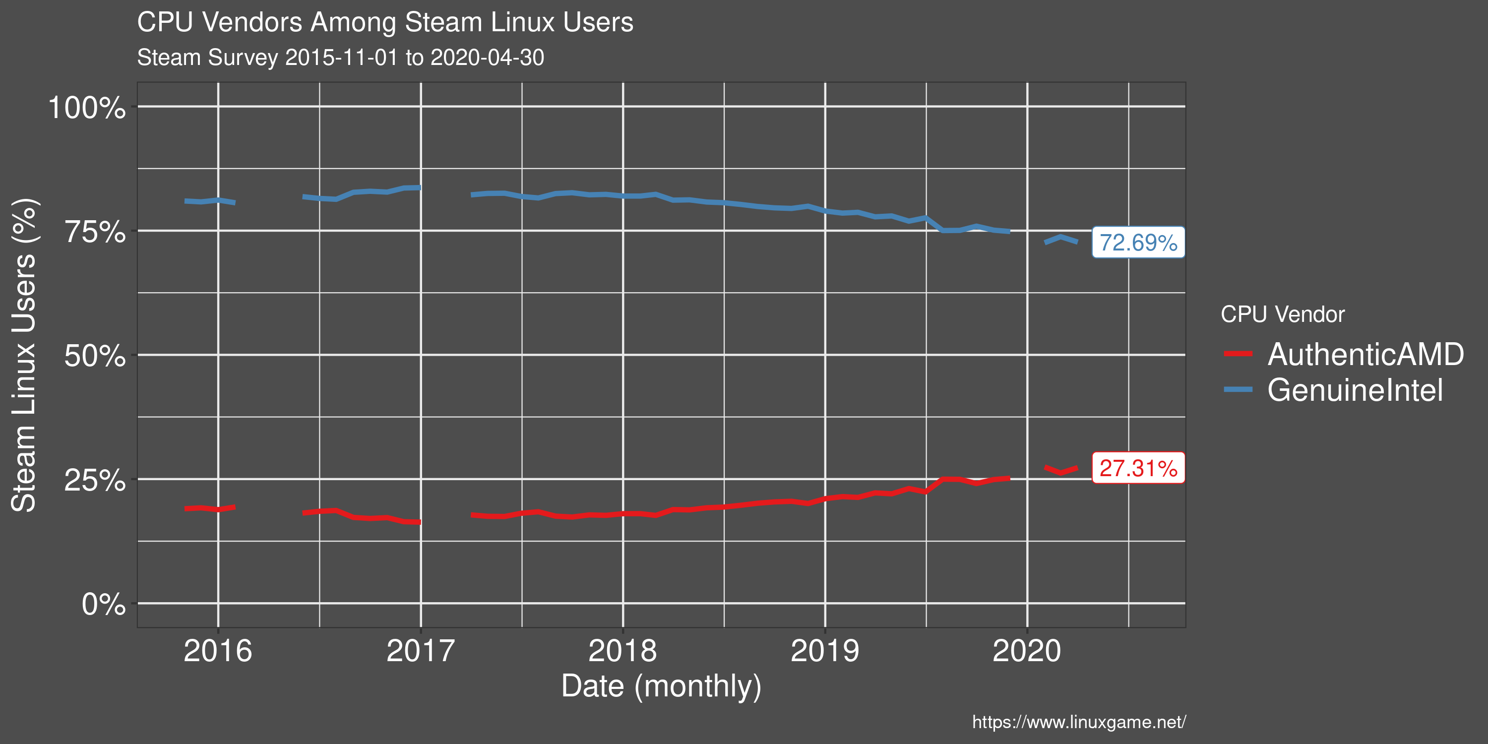
Processor Preference of Linux Users
Since the release of AMDs Ryzen CPU line in early 2017, more and more Linux users have been foregoing Intel processors in favour of AMD. However, Intel still has a clear market lead.
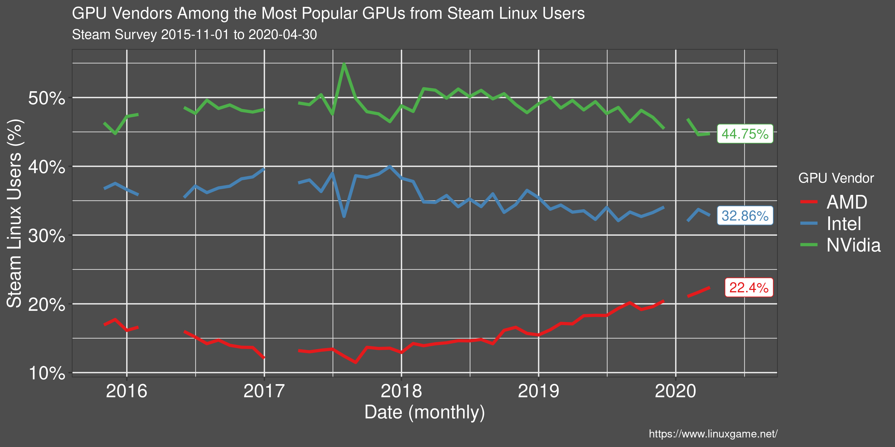
GPU Vendor Preference of Linux Users
AMD is taking up ground in the GPU space among Linux users on Steam. The results of AMDs open source initiative began to bear fruit in 2017/18 as game performance approached some of Nvidia's offerings.
Despite a closed-source video driver, Nvidia still remains the main choice among Linux users.
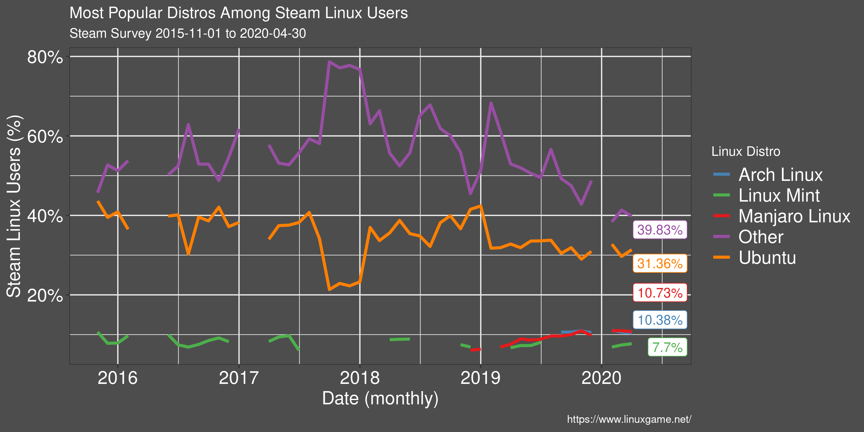
Most Popular Linux Distros
Steam (unfortunately) does not report many different Linux distributions, preferring to group most in the 'Other' category.
Ubuntu remains the most popular Linux distribution on Steam and many Linux games specifically target Ubuntu as a supported OS. This has the effect of generally being the smoothest experience for new users.
Outside of Ubuntu, there is a great variety of Linux distributions, many of which will also have no issues running games on Steam.
In addition to the snapshot of data above, I've setup a page on my Linux gaming blog with the same charts that are updated automatically, with an R script, whenever new data becomes available.